Two More Contenders for Best Cover of The Year
Earlier this year I posted on what I thought were the best newsstand covers of 2011 "so far". Here's a not so dirty little secret: While us circ. folk do have a check list of what it takes to create a good magazine cover, in the end it's the first visceral reaction to the cover that determines whether or not we're going to pay attention to it.
Then again, you probably already knew that.
Once a cover catches my attention, I do go down the check list to see what it was that got me to pay attention: The main image, logo placement and font style. Color, use of cover lines and use of skyline. Are there secondary images and do they make sense? And so on down the line.
Maybe that's why so often circ. people are barred from the room when the editors and art folk design the covers. They don't want to hear what we have to say.
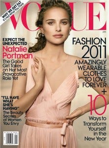
Personally I still think the January 2011 Vogue cover featuring Natalie Portman is the best thing we've seen so far. And no, it's not because I like Natalie Portman (although that helps).

Over the past few weeks, two other magazines have made me stop, turn around, head back to the rack and snap a pic with my balky pain in the neck 'droid (the Windows XP of Smart Phones).
May I present for your consideration two more contenders for "Best Cover of 2011" (so far):

When was the last time anyone paid any attention to Interview Magazine? In the '90's we saw a burst of copy cat magazines pop up around the celebrity/fashion/design world and through it all, Interview has survived. Striking cover image? Check! Great use of color? Check, well at least with the logo, but here is a case where B&W will work! Cover lines? Umm, probably too much for my liking, but on most racks, what will grab you is the image of Anne Hathaway behind the lace and the red, red "Interview" logo.
So yes, Interview, I apologize for neglecting you. You are now on my radar. In a very good way!

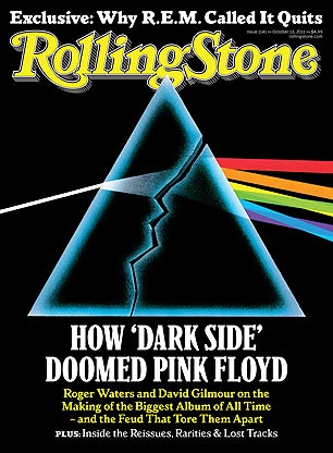
In theory, Rolling Stone should be another one of those "Whatever Happened To...?" magazines. It's heyday was way back in the '60's and '70's and all the Boomers are now heading to the Social Security office. But good editing and design is good editing and design and Rolling Stone still has it. And guess what non-believers? RS saw an increase in circulation in the last ABC report.
You'll recall that I picked their Steven Tyler issue as a "Top Ten" back in June. Upon review, it remains a contender.
Now we can add this pictorial cover that will not only grab any music fan of a certain age, but is strong enough to reach down and grab any music fan of any age who knows about or is curious about one of the most amazing albums of all time. It's a fantastic use of the iconic Dark Side of The Moon imagery. The REM mention in the skyline is a great twist on the main cover section (How one band decided to break up, how another struggled). While I'm rarely a fan of yellow in a magazine logo, this works.
So in one week, two things that I am generally skeptical about when it comes to covers: B&W imagery, yellow logos, caused me to turn around, retrace my route, pluck the magazines off the rack, and then fiddle and curse at my 'droid while I snapped their pics. Once more, may I extend my apologies to the startled B&N employee who I am sure I offended while I was doing that.
So let's hear it. What are some of your favorite cover images so far this year?


