The Top Ten Magazine Covers of 2015: The Completely Biased, Highly Subjective, Unscientific List
Well, that's (almost) over. Depending on what list you look at, either we had a giant bumper crop of magazine start-ups, or we held our own. Print subscriptions are getting sold for next to nothing, digital subs are going nowhere, and newsstand circ is somewhere in the neighborhood of Hades. If anyone can find a 24 foot mainline in their neighborhood supermarket, let me know. But the actual magazines. They looked great. Lest we forget while we drool over the digital gee-gaws and debate pricing policy, in the end, it's all about the written word, the way the written word is laid out, the way the pictures help tell the story. How do we attract our readers? With great covers. Other "Top Ten" lists demonstrate the best sellers or look at the top titles from the top companies. Here on the Titanic, with the deck now listing bow down at 40 degrees, the rules are the same as they were in the past two years: What grabbed my attention as I walked by? What made me stop, back up, take another look and pick it up. For complete transparency: in a few cases some of these selections were brought to my attention via an internet based article or news release. In those cases, I went out in search of a copy (I'd highly recommend using MagNet's "MagFinder" app) after seeing the great cover in pixels. The future of bricks and mortar retail will be in how we use digital to encourage people to leave their homes. Please stay tuned because in the next post I'm giving you four "Runner's Up" and for the first time ever on the Titanic, a brand new award: "The Year's Most Egregious Cover". Is it going to be clickbait? Oh, you bet.
The Ten Best Covers For 2015
#1: Time Magazine May 5, 2015 Here's a great case where black and white and white and limited cover lines tell the story. How stark. How immediate. How recognizable. The point is quickly made and simple to understand.
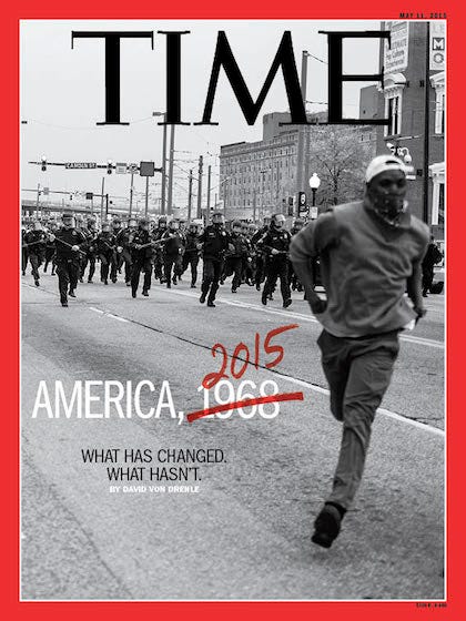
Is this Ferguson in 2015? Or 1968? #2: Hi-Fructose Magazine Spring 2015 Timing is everything. About the time the movie Big Eyes about the artist Margaret Keane arrived, Hi-Fructose Magazine put a perfect demonstration of a perfect illustrated cover onto the rack. Again, all of the cover lines rules are broken, but in this case, they are not necessary.

The illustration says it all. #3: Paleo Magazine June/July 2015 Food magazines continue to thrive on the newsstand. Take a look at any sized mainline and what you will see is both regular frequency and book-a-zines taking up more and more space. I have to admit that I didn't know much about the "paleo" diet movement. After stopping, backing up, picking up, and then buying the June/July 2015 issue, I learned something new. And come on, that salmon looks really good.

Seriously, that looks really delicious! #4: Hour Detroit Magazine August 2015 All city magazines have "Food" issues and "Best Restaurant" issues and "Best New Chef" awards. They sell well, everyone likes them, and they're a great way to show the world something unique about your community. But doing a good food cover is not easy. Hour Detroit accomplished that feat this year. Who knew vegetables could look so good?

None of those vegetables came from my garden. #5: Wonderland Magazine March 2015 While I don't think I match the target demographics of this UK lifestyle import, I look for every issue at my local Barnes & Noble, follow them on Instagram and just find their editorial and their social media very intriguing. For the second year in a row, Wonderland gets placed in the top 10 covers. This year they break the rules about black and white covers. Successfully.

Kristen Stewart was featured in the March issue. #6: Tie - Ebony Magazine November 2015 & New York Magazine July 27, 2015 How many covers did the Cosby Show snag back in the 1980's? How many young men and women wished their dads had the wit and wisdom of Clifford Huxtable? The sheer immensity of the rape allegations against Bill Cosby and the betrayal the black community felt because of them is clearly, poignantly and brilliantly on display in both of these covers.
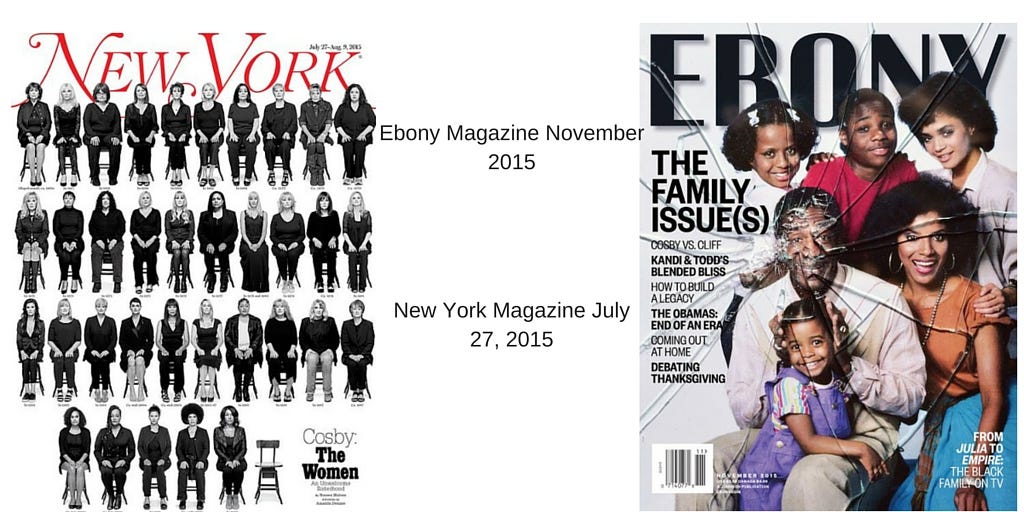
A sad story, powerfully told. #7: Tie - The New Yorker January 19, 2015 & Bloomburg Business Week April 6, 2015 It takes a moment to remember that before this Fall's terrible terrorist attacks in Paris, there was another attack in Paris on the offices of Charlie Hebdo magazine. This illustration says everything with just a simple twist on the iconic Eiffel Tower. No cover lines are necessary. On the other hand, Business Week's cover says everything with the image. But the headline, "The IRS Sucks" will fool you unless you read the tag line and realize that they're talking about the people who work for the embattled tax collection agency.
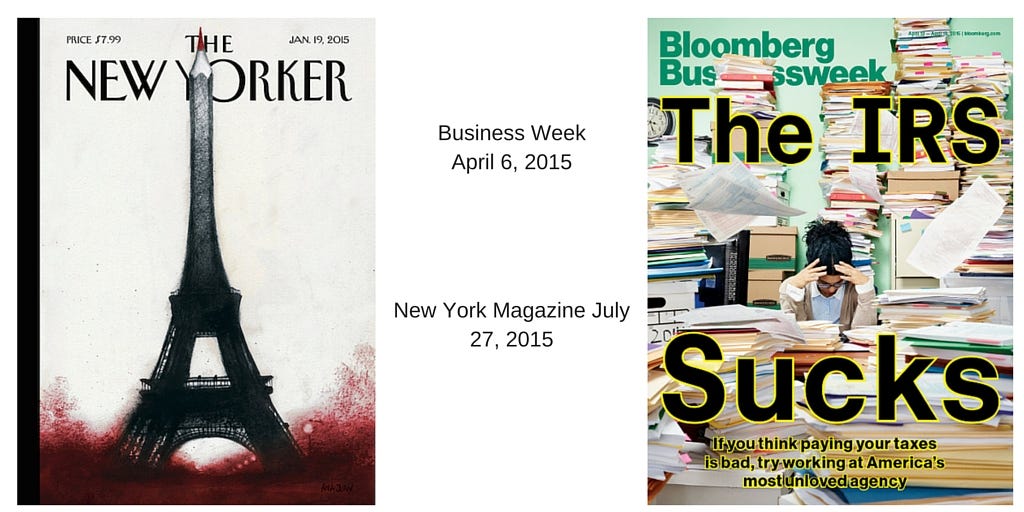
Two eloquent covers, one with words. #8: Redbook Magazine September 2015 While "authentic" is an overused and abused buzzword in the world of marketing, Redbook went with it anyway with their powerful Fall cover that featured "Real Women" (Not actresses or models). Did it work? You bet.
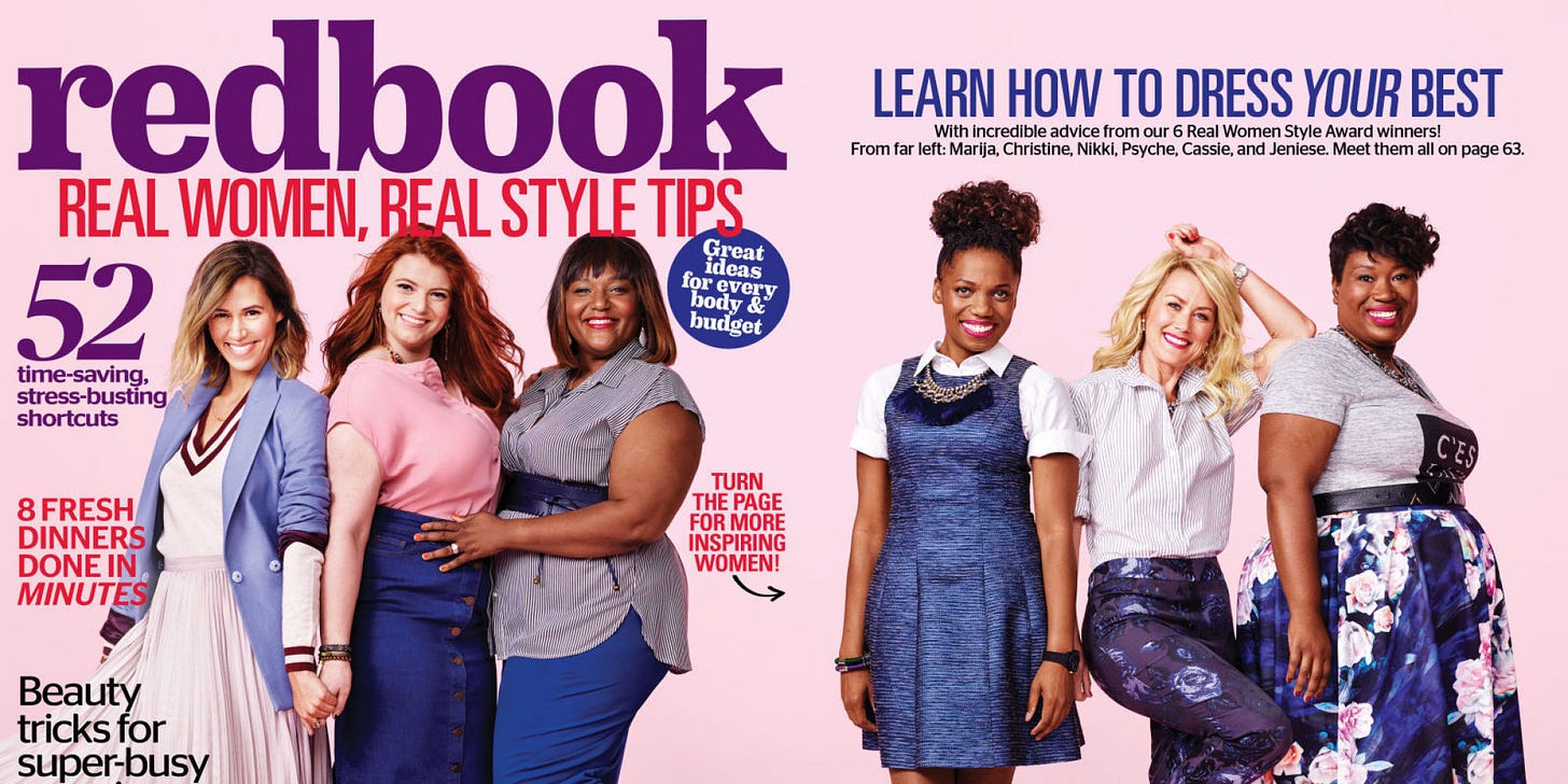
Real women, real fashion. #9: Dazed & Confused September 2015 I have to admit that this difficult to find UK import was one I didn't find on the racks. I follow them on social media and this issue made me click through to see the cover. I think it's a perfect example of how the alternative fashion 'zine world completely obliterates all of the rules about successful newsstand covers, and is still successful. If I'd seen this on the racks? I would have stopped and picked up a copy.
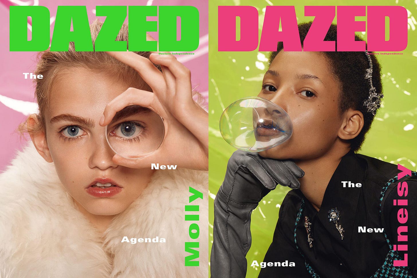
Click on this! #10: Canoe & Kayak June 2015 This activity magazine from the publisher formerly known as Source Interlink hits all the right high notes with their traditional but engaging cover. Beautiful blue serene waters? Check. Great cover lines focusing on the "Best" and even "26 Best"? Check. Does anyone know the science behind the trend of three separate topics in the skyline? I see it everywhere and I actually like it.

Admit it, you want to be there. And there you have it. A completely subjective list of the best covers of the year. In the comments below, feel free to chime in with your selections for the best things you saw out on the newsstand. Next up! The runners up for best cover and the first annual "Most Egregious Cover of The Year."


