The Top Ten Magazine Covers of 2012: The Completely Biased, Highly Subjective and Unscientific List
It's the end of the year and all of the top ten lists are hitting the racks, dropping into email boxes and getting passed around like so much Christmas candy. There are a lot of ways to look at what the best magazine covers are and from what I've seen, many of the lists that are out there are simply based on what the editors of that particular list thought was the best. Our friends at MagNet published a list last year that was based on actual sales data. That was an excellent idea. Like last year, the Foredeck's list is a combination of what newsstand elements seem to work best and what my personal favorites are. But truthfully, most of what I looked at when I put this list together was what grabbed my attention as I was browsing the mainline rack. Consequently, some of the titles featured here will actually contradict the "Best Practices for Newsstand Covers" document you will find on this blog. Some teenagers and young adults that I know refer to that practice as "hypocrisy". That is correct. Earlier this year, the Foredeck strayed way off course and published what we thought were the "Best Illustrated Covers of the Year (So Far)". Why? Mostly because I think that illustrated magazine covers deserved to be looked at differently from photographic covers and needed some of their own press. So it is time for the Foredeck to once and for all proclaim the winners of "The Completely Biased, Highly Subjective and Unscientific List" of the Best Covers of 2012. 1) Vogue Magazine February 2012 featuring Taylor Swift: No, I am not on the payroll for Vogue (Although that would be very cool) and, yes, this is the second year in a row that Vogue has placed first. But it could be because this cover, like last year's stood out so well. Great color, photograph, catchy cover lines.

Still haven't downloaded her music, but I did stop in the mainline aisle to note the cover. 2) Geek Magazine Volume 1 Premiere Issue: If I were handing out awards for notable launches, Source Interlink's entre would certainly place in the top five. Aside from being a great read, the cover image is guaranteed to attract it's target demographic. I mean what sci-fi, comic book, fantasy fan doesn't love Spider Man? Here's hoping this title has a very successful sophomore year, and beyond.
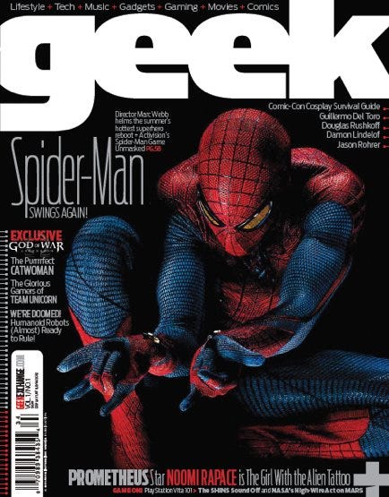
Spidey kicks a successful new launch! 3) Bullet Magazine Summer 2012: Here's another entre that earned a top top position in last year's list. And once again, the cover violates many "Don't Do This!" rules that are often associated with newsstand covers. But it doesn't matter because the image along with the stark white background pulled me to a stop and made me browse the magazine and that section of the mainline. I'm not a fan of Blake Lively's, but I am a fan of the image. And for a second year, a big fan of Bullett Magazine.
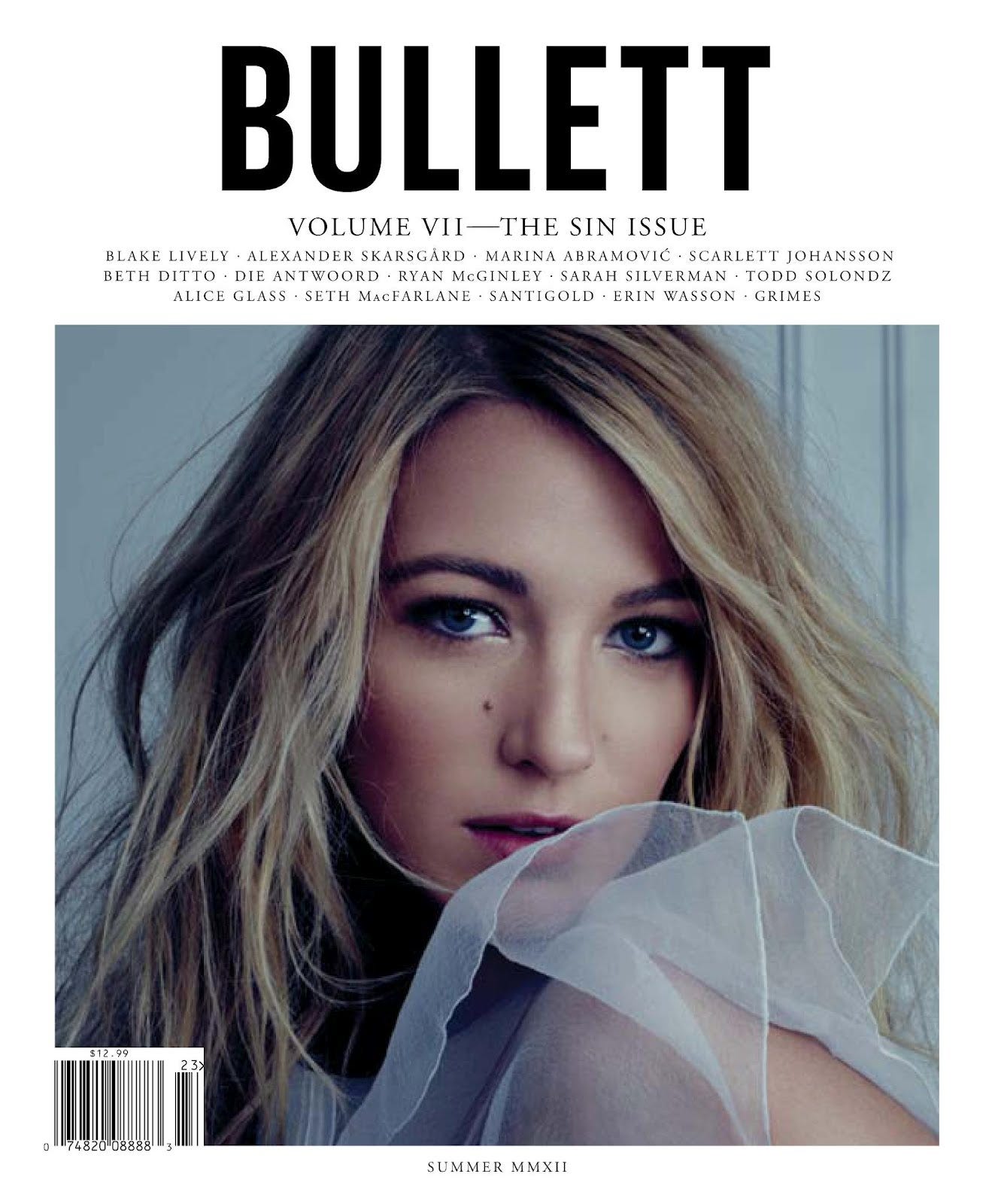
Another winner from Bullet Media. 4) Glamour Magazine December 2012: Actually it was my younger daughter who called my attention to this issue. As a rule I don't love red backgrounds or large quantities of cover lines. But Glamour get's a pass to the lifeboat with a great image, a shade of red that will burn your eyeballs, and some clever cover lines and use of the skyline. This must be the year for rule breaking.
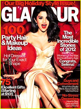
Gomez for the win. 5) Fur Fish Game November 2012: In our July "Illustrated Cover" feature, this small Ohio based publisher had it's February cover place in the top 10. I thought it was one of the best covers this publisher had ever produced (Editor's Note: Fur Fish Game is a long standing publishing client.). They wound up producing two really great covers this year and this one checks in at number five. With illustrated covers, your success is often dependent on how good the image is. In this case, it's a good one, and backed up with great line placements.

Good dog! 6) Runner's World July 2012: I can't remember the last time an issue of Runner's World stopped me. This time, however, it was most likely because since May of this year I've been back to training in earnest. The "Summer Training Special" in the skyline stopped me. The rest of the lines and the image also helped. I stopped, picked up the magazine. Then I opened it...Oh wait, isn't that how this is supposed to work?

RW asks if you can run a PR at age 46? If you take a running jump from the Foredeck, you can do it when you're older too.
7) Smithsonian March 2012: While I like the mid year redesign of this venerable magazine, the March issue literally leaped off the rack into my hands when I walked by. OK, the image is obvious when considering the name and background to this blog. But that is one heck of a great image. One great use of the skyline. And kudos to the art team for not cluttering the image with a lot of cover lines. They weren't necessary.

As you can see, you can get off quicker if you're on the foredeck. 8) Boston Magazine February 2012: Does every city magazine feature a few food covers? Yes, they are ubiquitous, easily dismissible, often forgettable, frequently abused. But I think Boston Magazine nailed it last winter. Along with a very attractive cover image, we also get some great cover lines in the sky line and a large, simple, hard to pass by call out to the magazine's main content.

Just don't eat out in Bean Town with any raging narcissists, OK? 9) Mother Jones September 2012. This years crop of election oriented covers were catchy and clever. But Mother Jones squeaks by with a win with a clever take on the Statue of Liberty. Love the red boxing gloves. Love the snarky sonogram reference in the skyline.
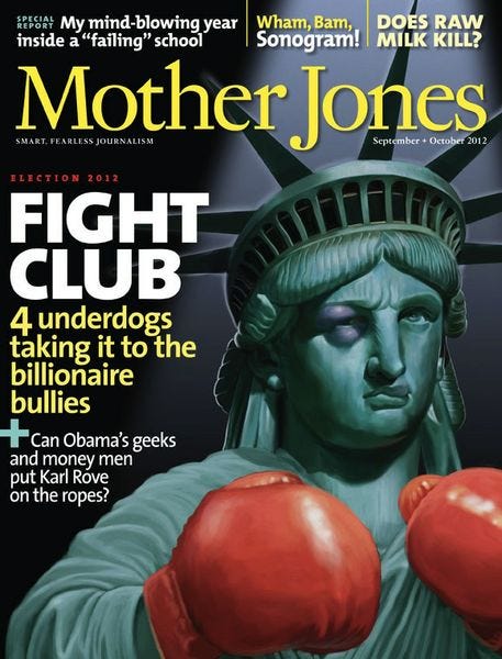
Don't mess with Lady Liberty! 10) Mollie Makes Issue 19: The crafts section of many mainline racks are chock full of magazines that I, admittedly, pay little attention to. That's a habit I need to break. This British import from Future places high in B&N's ranking reports and in a recent trip to a local store, this one dropped into my hands. An unusual color, an interesting issue, a cover cut that grabbed my attention, it's time an import made the list.
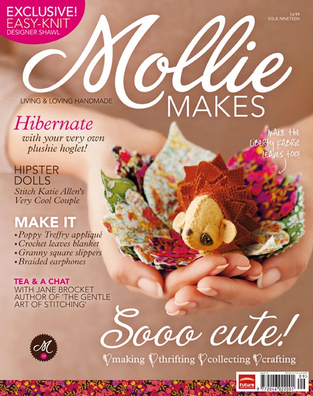
A good image and a cover cut makes the final cut for this import. The cover image folder on my desktop is overflowing with display photos and captured cover grabs so later this week I will be publishing my list of the five "Runner Up" cover images for the year. Stay tuned to your Marconi for further details. What are your choices for this years best covers?


