The Top Ten Magazine Covers of 2011: The Completely Biased, Highly Subjective and Unscientific List
Every year around this time, newspapers, magazines, blogs and digitally based publications swamp us with their "Top Ten" lists. They cover everything from 'The Year in Review' to what not to wear to a holiday party to the 'Hottest Songs of the Year". Inevitably, we come across the "Top Magazine Covers" of the year.
The presentations are interesting and offer up very attractive covers. But they're rarely from the perspective of people who have to work with the results of the art and editorial departments. You know, the circulation folks. You know, those guys and gals at the back of the office? The ones that flinch every time the CFO walks by?
Halfway through this year, the Foredeck posted what we thought were the best covers so far.
So what's changed? Who stayed on top from that list? Who's dropped off and who's been added? You'll see below. And because there were so many really great covers put on the newsstands this year, I decided to add a new category: "Honorable Mentions".
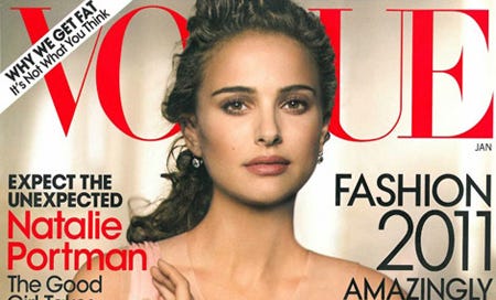
1. Vogue Magazine - January 2011 Featuring Natalie Portman: When I first saw this cover a year ago, I swore it was one of the best covers I had ever seen. Only two other covers have ever affected me like that: A neon colored Vanity Fair cover of rock stars, and a Chicago Magazine whimsical creation that offered up the "Secrets of the City". The coloring, the positioning of the actress, the class and elegance that exude from this cover are the elements that do it for me. Heck, I actually bought a copy! And no, it wasn't the best selling cover of the year. But it did well.

2. Interview Magazine - September 2011 Featuring Anne Hathaway: This fascinating cover made it on my October "Two More Contenders For Best Cover of the Year post from October. I hadn't paid any attention to Interview Magazine on the racks for a number of years, but this cover was front and center and jumped off the rack at me. Generally I warn clients to stay away from arty black and white covers. But the editors at Interview have clearly figured it out. Guess what? This does appear to be one of the best selling issues of the year.

3. Outside Magazine - May 2011 Featuring Steven Colbert: I pointed out in my June "So Far" review that aside from the great cover image, one of the selling points for me on this cover was Outside's use of the skyline above their logo. They use it well. Moreover, while this longstanding newsstand favorite uses a lot of cover lines, their lines for the Colbert story are clever and funny without being too cute. That's rule #1 in my book for cover lines. You can always be too cute. Was this one of their best selling covers of the year? No, it was not. Didn't I say this was subjective and unscientific?

4. Bullett Magazine - Vol. #4 Featuring Saoirse Ronan: This magazine lives in a well traveled niche covering the world of fashion, art, music, film and entertainment. They compete directly with the likes of Interview Magazine in a category that is so crowded, you have to ask what makes you so different? Your editorial will certainly differentiate you but how do you grab readers from a crowded bookstore newsstand? If you're Bullet, produce cover after elegant cover with the newest stars. Volume 3 features a close up of the striking Irish actress Saoirse Ronan of Hannah.
Yes, it does appear to be on of their better selling issues this year.

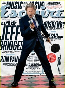
5. Esquire Magazine - May 2011 Featuring Jeff Bridges: I've liked just about every single cover that Esquire has produced this year. Even the much hyped but underperforming Brooklyn Decker feature from February actually sold better than this cover. But I chose it to illustrate how even a middling performing cover from Esquire has all of the elements that make a good cover. A great image, cover lines that inspire and ask you to pay attention, good use of color, and a kick you in the seat of your pants use of the skyline. And this year I officially became an old guy so Jeff's my guy.
6. Entertainment Weekly - March 17 Featuring Nathan Fillion: There is absolutely nothing wrong with this cover featuring Castle start Nathan Fillion. The colors are right. The cover lines scream exactly the right measure of "OMG" and "FTW". The skyline has everything an entertainment junkie could like. Have I mentioned that Entertainment Weekly is my favorite magazine?

7. The Knot - Spring 2011 Issue: The Gown Guide enters it's second year of higher frequency publication with a cover that I was sure would be a hard sell (Editor's Note: XOXO Group is a client.). But look at that dress! And look at those blues! And look at those cover lines! Not only is this cover the best selling of the year, the sales volume in many of the largest retailers was through the roof. In this case, the ice berg warning from the Foredeck was pretty far off. Thank goodness!

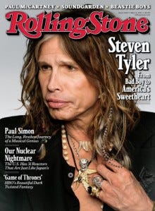
8. Rolling Stone - May 12 Featuring Steven Tyler: Shouldn't this magazine for aging Baby Boomers be as cringeworthy as a critique from the American Idol Judge and Aerosmith frontman? Well, no. I picked up this issue of the magazine because the image drew me in. What is Tyler looking at? What about "Game of Thrones"? Many publishers now do what RS does with their skyline, put three different stories up on top. They lose points for simply dropping names, but get them back for solid cover lines in the body and great images.
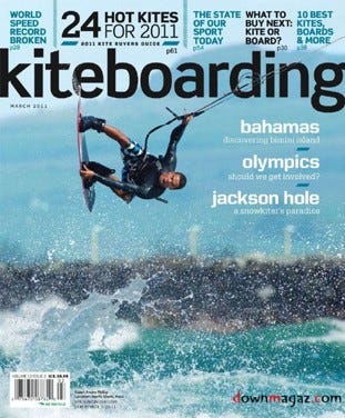
9. Kiteboarding Magazine - Feb/Mar 2011: This bi-monthly action magazine from Bonnier shows how to mix action, color and the right way to to put multiple lines up on the skyline. Rather than simply list names (We're talking to you, RS!), they let the action picture speak for itself and promise more action with cover lines like "24 Hot Kites" and "World Speed Record Broken".
10. Arizona Highways - September 2011 - Photography Issue: I'm a huge fan of regional magazines and this venerable state publication shows another way to do a black and white cover that draws you in and says "Pick Me Up!"

But wait, there's more!
Today's social commentators have enormous fun pointing out that we live in the age of the participation trophy. Everyone's special, therefore no one is special and all our standards have been lowered. Nonsense. There's just a lot more of us now.
And there are more magazines than ever and more selections than ever. So this year, we made room on the Foredeck for some "Honorable Mentions" in the world of newsstand worthy cover images.
1st Honorable Mention. Newsweek -Feb 7, 2011 - Featuring the Egyptian Revolution: Hi Time Magazine! Yes, we're talking to you.

2nd Honorable Mention. Portland (ME) Magazine - Sep 2011 - Featuring Patrick Dempsy: McDreamy goes to Maine? This small city regional manages to get it all right on one cover. A memorable image, great color; sharp, short, snappy cover lines. Oh yes, great skyline.

3rd Honorable Mention. Juxtapoz Magazine -Apr 2011 -Featuring Art in The Streets. This one is counterintuitive. When the magazine first arrived in the office (Editor's Note: I work for High Speed Productions, the parent company of Juxtapoz) my reaction was unenthusiastic. But every store that I visited that carried this issue had it out on the front lip of the front shelf. It was one of the best selling issues this year. Why? A memorable topic (Street Art), simple design, an online ad campaign to back the issue and an image that grows on you.

4th Honorable Mention. Hour Detroit - Jun 2011 - Featuring The Best of Detroit. What I like best about this cover is how different it is from most typical "Best Of" covers. The illustration, the embracement of what makes Detroit a great city.

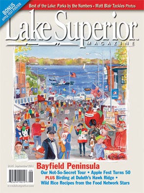
5th Honorable Mention. Lake Superior - Sep 2011: Well, why can't the greatest of the Great Lakes have it's own magazine? And why not a really colorful illustration that shows off the fun to be had?
So there you have it. The best for this year and five "Honorable Mentions". While beauty is often in the eye of the beholder, you should always keep in mind that you have many audiences for your cover. Newsstand cover design is a mixture of art, science, algebra, voodoo and strong opinions. For my short hand on how to develope a good newsstand cover, click here.
Are these your favorites? What are your selections for the best covers this year?
Want your own copy of this years' list? Click here: 2011 Best Covers


