The Completely Unscientific List of The Top Ten Magazine Covers of 2011: So Far
At the end of every year, magazines, newspapers, online news sites and blogs of every stripe list their "Top 10", "Top 20", "Top 100" lists on nearly every single topic that you can imagine. For the purposes of this blog, we're mostly interested in magazines and magazine covers. Last year, we published a Completely Unscientific List of The Top Ten Magazine Covers of 2010 and the list garnered much traffic, email and comments.
So now that I've sent in my quarterly tax estimates, filed my June expenses, taken a look back at the first half of the year in a businessy kind of way, it seemed appropriate to take a look at the magazines that inspired me in the first half of 2011. What, in my opinion are the top covers?
Keep in mind that when I look at magazine covers I'm looking at them from the perspective of someone who relies on the ability of that magazine to be sold from the newsstand. It's not all sex and cheesecake, people (although that sounds really good). It's also about the ability of that cover to:
Speak to the audience the editors intend.
Clearly state what that issue is all about.
Show a clear, decisive, identifiable image.
Invite the browser to become a reader.
Because if the browser won't buy what you're selling, you've got nothing. Free's wonderful. On the web. But at some point, you need revenue.
So here they are in all of their glory. My unscientific, totally biased and highly opinionated "Top Ten Magazine Covers of 2011: So Far"

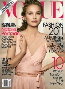
1) Vogue's January 2011 cover featuring Natalie Portman: For me, this is quite possibly one of the best covers ever. In some ways, the coloring seems all wrong and the cover lines violate my rule of "Too Much". But from the moment I saw this magazine on the rack, I knew it was just simply an amazing cover. It is everything that makes Natalie Portman a movie star and Vogue the trusted and much loved fashion nameplate that it is. And while not the best selling issue of the year so far, it's one of the best selling.

2) Outside Magazine's May 2011 cover featuring Stephen Colbert: What can you say about the Comedy Central funny man and his fantastically flexible face? Outside gets props for getting a celebrity on the cover and then featuring an article that is both funny and informative. And from me, they get props for the wonderful use of their skyline. Was this their best selling issue of the year?Ummm, near as I can tell, no. Did I say this was scientific?

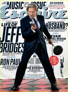
3) Once again, Esquire Magazine's May 2011 issue shows why they get it when "getting it" means producing interesting, amusing, creative covers. Check out Jeff Bridges awesome pose, the great cover lines ("Are you a good husband?"), the use of the skyline.

4) My favorite magazine (Columns by Ken Tucker, anyone?), Entertainment Weekly, usually has forgettable covers. But this one had me geeking out with their March 25th issue. While I'm not a huge fan of the "Castle" TV show, Nathan Fillion's pose, any mention of "Firefly", is enough to get me to grab it off the rack. The colors are right, the pose is amusing, the coverlines read perfectly for the audience they are aimed at.

5) This offering from the Boy Scouts of America has changed dramatically from my days with Troop 32. I wasn't even aware that they were on the newsstand until this March 2011 issue poked it's cover at me one day. And by looking at it, you can see why. This is one great way to emphasize your "Top Tips" list and the fact that it's a "Special Collector's Edition". Hopefully the increased sales this venerable magazine generated also brought them some more potential Eagle Scouts.

6) The June issue of Hour Detroit exemplifies for me the best way for a regional magazine to promote their "Best of" issue. In a later post, I'll cover my favorite "Best of" covers, but for now, just look at how Hour Detroit used color, what makes their city a great place, and how they try to generate excitement.

7) In my mind, the continued success that National Geographic has on the newsstand with both their monthly magazine, the spin off titles, and their Book A Zines, shows how much vitality there still is on the newsstand and why we have to fight to make sure we merchandise and market our publications properly. This issue works simply because of the image on the cover. How can you not walk by this cover on a mainline rack and not be drawn into the penetrating eyes of this computer designed pet? And, there's a free poster inside. See, in this case, Free=Revenue. Get it?

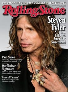
8) Leaving aside Steve Tyler's cringeworthy comments in the latter episodes of "American Idol", this long time frontman for Aerosmith is the perfect image for Rolling Stone and where it now exists as the longstanding magazine of record for both the Baby Boom generation, and the current chronicler of popular music and culture. This was issue #30 for May 11.

9) Editor's Note: I currently work with The Knot. When I first saw this cover, I was concerned because I hated the dress. In fact, my concerns were confirmed by an in-house focus group that consists of my high school aged daughter and her friends. On the other hand, everyone loved the colors and then grabbed the book off my rack and started flipping through it. Blue is a very effective background color. The coverlines are spot on for a bridal magazine: "800 Gorgeous Wedding Gowns" Yes, they are. And the model, how can you not look at her smiling face and not smile back? Did I mention that so far, this is the best selling issue of the year? How about the fact that it may be the best selling Spring issue in several years? So yes, I was wrong and the art department at The Knot was right. And that is a very good thing. Wait until you see the Fall cover!

10) Bullet Magazine describes it's mission this way: "...inform, provoke, influence and enlighten through the medium of fashion, beauty, music, film, art, entertainment, lifestyle and travel..." In one way, art and fashion magazines in this category often trend towards the obscure in their cover images. But I've been watching Bullett this year and I am really impressed with how penetrating and creative their cover images are.
So what have we learned so far this year? The world of magazines is alive and perhaps better than advertised. Our industry is still struggling to recover from the downturn of 2008-2009. We lost ground while many of our premiere companies downsized as a result of a loss of advertising and circulation revenue. We lost experienced and talented marketers while these companies shed workers so they could pay off the oversized notes that were used to finance the mega mergers of the last few decades.
But a simple perusal of the racks shows that there's never been a real lessening of interesting and compelling editorial writing and art. The presence of interesting and unique magazines like Bullett and the newly launched Carson Magazine indicates that there are audiences out there that still can be reached in this medium. That fact that long lived publications like Vogue, Esquire and National Geographic can still strum the strings of contemporary culture without appearing to try too hard shows that even these representatives of the larger publishing houses haven't forgotten what they are about. Smaller publishing houses like The Knot have rolled the dice on increased frequency and expanded presence at the mainline and been rewarded with increased circulation.
So the next time someone tells you that print is dead and gone, that there is no future, that you'd better get on board and give it all away for free, pat him on the back, give him a lollipop, and while I don't advocate this, you could unplug his router. But that would be cruel.


