The Completely Unscientific List of the Top Ten Magazine Covers of 2010
Around this time of year, publishers of every stripe start putting out their “Top Ten” or “Top Twenty” or “Top 100” lists. It can be celebrities, activities, places to party on New Years, last minute Christmas gifts. Pretty much anything and everything you could imagine. Which reminds me that I need to check out the dog and cat magazine category. I wonder what they rank in their lists? Recently “Folio Magazine” put out their top covers as determined by design concept and execution. An interesting way to look at what is essentially a sales tool and while I don’t argue with them, I have to wonder why these lists never include the opinions of the people who actually have to sell the designs and executions to the general public. You know, circulation people. We even sell digital now, you know. "Time Magazine" put out their Top Ten Covers list and while I liked some of their selections, they lost 4,529 points by making me click through ten separate screens to read their selection. Folks, I spend quite enough of my time clicking through power point presentations, thank you very much. So here you have it: My completely unofficial, unscientific, thoroughly biased and subjective “Top Ten” list of the best magazine covers of 2010:

1) Vanity Fair October 2010: At this point in the year, Lindsay Lohan had pretty much worn out her welcome. Even the weekly celeb mags that lived and died for the past three years on what pics their paps could snap of the troubled actress were tired. So here comes Vanity Fair to the rescue to make her look not only classic, but classy. Great cover lines too! I love the red tab on “Exclusive”. See, we marketing geeks look for things like that.

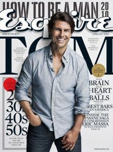
2) Esquire June/July 2010: Here’s another publisher who managed to take an actor who’s become an all too easy punch line for late night comics and made him accessible, easy to like and easy to sell. Light colors, good use of blues and Tom Cruise is smiling! Smiling! Get it? If your cover character is smiling, the chances are very good that the person who picks up the magazine will smile back! And then they’ll buy the magazine. Revenue. Get it?

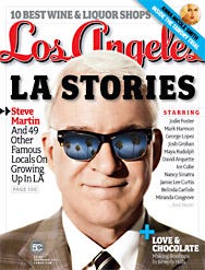
3) Los Angeles January 2010: I am particular to regional magazines in part because the good ones are intimate with their subject. Los Angeles nails this cover. Here’s one thing you may not notice. The skyline, “10 Best Wine and Liquor Shops”. No, not the liquor, the use of the real estate. It’s the perfect use of the skyline. Oh, and Steve Martin looks totally cool. Oh, and the list of celebs who add to the story is perfect. And so is the cover line to the Left of Steve Martin. This is cover perfection. For me, anyway.

4) The Knot Fall 2010: This year, The Knot did the unthinkable and made it work. This internet publisher who sort of backed into print publishing rolled the dice and doubled their frequency from bi-annual to quarterly (Editor’s note: I work for The Knot.) Not only did they not lose their editorial edge, but they continued to show bridal publishers the way forward with smart covers and continued to sell lots of this $9.99 quarterly. For years I’ve been preaching that if the wedding is the thing, and the bride is supposed to be happy about this day, why not photograph her smiling? Well The Knot did and this is what they came up with for their Fall cover. Happy brides, a happy color, and all around happy cover lines that invite you to plunk down some money and have a good read. The circ. guy was really happy with the final numbers!

5) Chicago Magazine July 2010: Chicago. Pizza. Need anything else? Oh yeah, the world’s cheesiest skyline tag. And it works! Brilliantly. Yes, I am obsessed with that piece of real estate.

6) The New Yorker October 11, 2010: As a rule, I advise clients to stay away from dark covers as much as possible. Stark, dark, they’re sales killers. But this illustration works so well and catches a moment in time in just the right way, I am giving it a pass and putting it on this list.

7) Somerset Studio July/August 2010: There’s reasons why I shouldn’t like this cover from the Stampington people. But I do. The coloring is just right for what they’re featuring and once again, I love the use of their skyline. It’s so obvious, and it’s so right. The model image captures everything that is on the cover. Believe it or not, some art directors miss this key point.

8) Traverse Magazine June 2010: This small circulation regional title from northern Michigan completely figured out how to celebrate their 30th anniversary in a unique and very clever way. (Editor’s note: I used to work for this publisher). Traverse often skirts the line between really nailing their covers, and missing by just a little. This cover captures their anniversary and why you should spend your summer season in Northern Michigan. You really should go there. It’s a beautiful place.

9) Thrasher Magazine January 2010: How does a thirty year old skateboard magazine stay current and keep refreshing it’s audience? (Editor’s note: I currently work for High Speed Productions, the parent company of this magazine). Skateboard covers are sometimes limited in terms of what they depict. In this image, the skater is doing his trick on a wall covered with amazingly colored graffiti. They also make good use of their cover lines by hawking some interesting features. But it’s the color that got me on this one. And it was one of the best selling issues of the year.

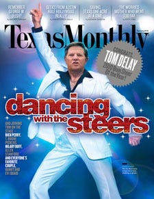
10) Texas Monthly January 2010: Another regional magazine works it’s way into the mix. This venerable title takes an odd but familiar pose by disgraced politician Tom Delay, and makes it funny and even a little hip. Note the play on the issue’s special feature, their annual “Bum Steer” awards. It’s in a big silver star. No way you can miss it. And, I keep pointing it out, because it’s so incredibly important, check out their unique spacing on the skyline. So there you have it. What I think are the best covers of 2010. Quibblers and naysayers are invited to post their opinions in the comments section. People who think I am genius are encouraged to hire me out. What do you think were the best covers of 2010?


