The Best Illustrated Covers of 2012 (So Far)
Does a cover illustration carry the same impact that a live action shot does? Like all things involving cover images the answer is, “It depends.”
It will depend on the image, how much it relates to the magazine. Does it enhance and explain the cover story? Or take away from the contents inside the magazine? It may often depend on the magazine’s history. For example, my client, Fur Fish Game Magazine has an 80 year history of producing nothing but illustrated covers.
This is something that the readers depend on. It cements the brand and informs both the casual passerby and the avid reader exactly what to expect inside the magazine.
While I’m not a hunter or trapper and my fishing skills are less than capable, I have to admit to looking forward to the image I see each month with the magazine arrives.
What makes a good illustrated magazine cover? How do the editorial and art departments find the right piece for the cover?
I’ll have more on that from some editors and publishers in a later posting.
Below, for your acceptance (or snorts of derision), are the best illustrated covers (so far) that have caught my eye while visiting newsstands in 2012:
1) Business Week's "Let’s Get it On". The moment I saw this cover, I immediately heard the Marvin Gaye song in my head, and then cracked a smile. My next thought: “Best.Coverline. Ever!” The image is immediately recognizable, highly sellable (important in the single copy world), and remarkably colorful.
If you didn't hear Marvin Gaye in your head when you saw this cover, then...well...
2) Smithsonian: March 2012 Titanic: What’s that line about being the first to market? The March issue was out one month before the 100th anniversary. Smart. The image itself has a sort of 3-D look to it and, like the Business Week cover in 1st place, is immediately recognizeable.
No icebergs in this cover!
3) New Yorker 03/12/12: You don’t need to be a political junkie to chuckle when you see this cover. Mitt Romney's “Seamus on the Roof” story has gotten a remarkable amount of play (Thank you Gail Collins) and even generated a “Dogs Against Romney” web movement. So it made sense that back in March when his campaign was in danger of going completely off the rails, that The New Yorker would show the erstwhile ex-Governor and CEO with his number one competitor, Rick Santorum, on the roof. What a great image!
This is where Santorum wound up.
4) Juxtapoz Magazine Jan 2012: (Editor’s note: High Speed Productions, the publisher of Juxtapoz, is a client). Artist Audrey Kawasaki is well known for her feminine illustrations. Her cover feature for the January 2012 issue her work was immediately recognizable and stood out from the other magazines in the Art category. Note that this was also the number 1 selling issue in every class of trade to date for the year.
Best seller this year.
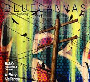
5) Blue Canvas Issue 12: This artistic competitor to Juxtapoz went colorful with issue 12.

6) Texas Monthly, March 2012: Does anyone out there think air travel is a pleasurable and relaxing activity? No? Is this a great year for airplane covers? Yes! The March Texas Monthly took it to the bank with a great cover story and illustration about the Dallas hometown favorite, Southwest Airlines.
Just make sure you're dressed appropriately when you board.
7) Fur Fish Game Magazine February 2012: Every year, FFG produces a few covers that take my breath away and make me want to go outside. The February issue did just that.

8) New York Magazine March 12, 2012: Most city magazines go with something a little too cute or clever for their “Best of” cover. Not New York. The illustration is bold, colorful, straightforward, and very attractive.
A great take on how to do a "Best of" regional cover.
What illustrated covers have caught your attention this year?


