Rachael Ray Gets It - And Then Gets Lost
As a guy, I don't think I'm supposed to like Rachael Ray. I think I'm supposed to be annoyed with her energy, her perkiness, her upbeat style. At least, that's what the snarky gossip blogs say.
Truth be told, I've admired her since I first saw her on what I think was a Travel Channel special where she toured the streets of Boston, ate food from Fenway Park, and visited with my hero, Luis Tiant in his restaurant.
So it was no surprise to me when it was announced in 2005 that she was teaming up to launch a magazine based on her popular TV series. It was thrilling to learn that it was a circulation and advertising hit. She had the right demographic, the timing was right, and while I'm in the wrong demographic, I had to admit that the magazine was well done.
Two years ago, The Food Network Magazine was launched and it stole Rachel's thunder. That happens. But what happened next is encouraging.
This month, the May issue of "Every Day With Rachael Ray" is being relaunched. According to Folio Magazine and AdWeek, the magazine has been completely rethought. There are now four distinct sections to the magazine, added offerings on the web site, more informal graphics that look like handwriting, and more attention to detail in the food shots.
Our industry needs magazines like these. Ones that are based on name celebrities. But, these are celebrities who are approachable and likable. Moreover, we need magazines that aren't afraid to take a long hard look at themselves, understand why their circulation and advertising revenue is declining, and then make adjustments so they can remain viable.
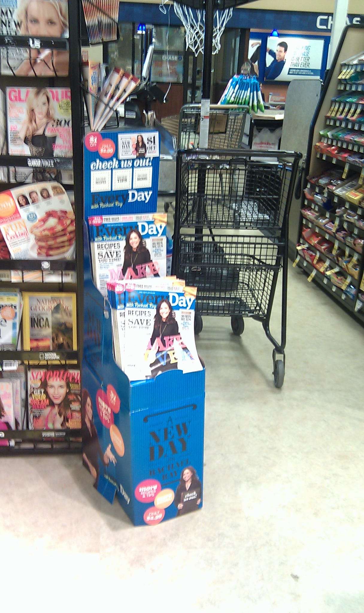
I have to say that as a member of the single copy side of the industry, I was thrilled to find over the weekend that the relaunch effort spilled onto the newsstand with a special display and $1.00 off promotion in a local supermarket. The dump display looked well designed and I absolutely loved the new cover of the May issue (see below):

But, then, in typical fashion for our industry, a second look revealed that the display was located in - yep - a dead aisle.

To be fair, there wasn't a crate of strawberries or cookies in front of the display. And, the display was very visible from main aisle. So let's hope that there were a lot of these dumps located in stores around the country and that readers respond enthusiastically to the new redesign of this title.


