Newsstand Reality vs. Publishing Design
Two very fun things turned up in this week's hard slog through the marshlands of galley preparation and budgeting: My recently ordered "Cover Junkie" arrived via FedEx, and the good folks at MagNet released an e-blast listing the top performing covers on the newsstand in 2011 based on the actual sales data they collected through the year.
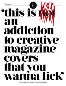
Cover Junkie is the brainchild web site and social media project of Netherlands based magazine art director Jaap Biemans. His website is a drool worthy time killing collection of some of the most interesting, beautiful, jaw dropping, and "What the heck(!) were they thinking" magazine covers. The Facebook page is a daily shout out to the best cover of the day. Their Twitter feed is a lively day long journey through the world of magazine design.
If you're on these two social media sites, save them in your favorites and start interacting. You'll learn more than you could imagine. If you're not on social media while working in this industry and you don't think it's time well spent, learning and sharing, well, I can't help you.
From a US based newsstand sales and marketing guys perspective, the Cover Junkie Magazine is a personal hand held extension of the revelation that the site has been. Holy smokes - is my perspective on print magazine design narrow and provincial.

Some of our great publications are mentioned like Wired, The New Yorker, Esquire. But have you ever heard of Germany's "Zeit Magazine"? Italy's, "Internazionale"? For that matter, how many American publisher's are aware of our own homegrown "Vice Magazine"? Had you ever heard of "Adbusters" before the Occupy Wall Street movement got started (Actually, those last two I had heard of, but only because of Cover Junkie.)?
In contrast, MagNet, the single copy sales data collectors, published "The Most Effective Covers of 2011". MagNet points out that from a single copy sales perspective, the most effective covers are the ones that sell the most copies. Believe it or not, this is a fact that often seems to escape notice in many publishing offices.
Two interesting streams of thought stand out in MagNet's reveal:
1. Many of the best selling issues were specials and one-shots. These are what the Dead Tree Edition referred to as "Zombies". Leading the pack was National Geographic's Wildlife Photography special with unit sales +300% higher than any other National Geographic title.
2. Not surprisingly, all the best cover advice in the universe will not guarantee a great unit sale or sell through at the newsstand. The list the Foredeck put forward last month was completely biased, highly subjective and unscientific.
Why did I do that?
Because when it comes to newsstand sales, once the copies are printed, shipped and the retailers invoiced, there's absolutely no control for things like:
The national economy
The local economy
If your national distributor properly billed the title (A problem that usually only pops up when the publisher changes something at press and fails to inform the distributor)
If your local wholesalers properly bill the title (See above)
If you properly printed your UPC code on the cover (No, I'm not kidding)
When local wholesalers make their deliveries
If the local merchandisers give you a favorable or unfavorable display
If there's something in the magazine that will cause a national retailer to pull your magazine from the shelves (Anyone out there remember the original Sassy Magazine?)
If a national retailer suddenly drops you from their authorized list just before you go on sale
This list could go longer, but I'll spare you the agony.
So save Cover Junkie to your favorites and start looking at things with yet another new perspective. And while you're at it, keep in mind that design is important, and so is the sale that will put money into your pocket and keep your magazine flying. That means your readers will want more.
Isn't that why we publish?


