In a perfect world, some of the more prized Halloween candy is safely hidden and waiting to be raided for an afternoon snack. If you’re hosting Thanksgiving, you already have an idea about what you’ll be serving, who’s willing to sleep on the sofa bed, and who’s the unlucky family member who gets to sit next to Uncle Phil.
We’re almost at the year’s end. Up north, all the leaves are down. Down south, the locals are bracing for the snowbirds. Here in magazine land, we’re waiting for the C-Suite to ask for more KPIs about the year. Will that conversation go well? Let’s open the deck.
But let’s sidestep that one for a minute. Ten years ago, I was writing on WordPress. The blog was called “From the Foredeck of the Titanic.” The name was a take on a conversation I overheard once when a local publisher told a roomful of magazine representatives they were just like passengers on the fated Titanic.
Once a year, I would post a personalized list of my top ten magazine covers. It was my contribution to the listicle trend.
Out of curiosity, I recently looked at what I posted ten years ago and I thought maybe you’d like to journey back with me. Where I could, I’ve taken the liberty to post a copy of a cover from a similar issue from 2023 next to the “award winning” cover.
From the Foredeck of the Titanic
The completely biased, highly subjective, unscientific list of the top ten magazine covers of 2013
With cover updates from this year
Editor’s Note: Music to accompany this post, courtesy of YouTube, the angel voiced Syd Straw, and David Letterman.
Another year, another add to the many “Best of” lists we get to read and enjoy.
Late last week a colleague called me. He was full of laments. The year had started with such promise, he said, and ended on such a sour note. It felt like the wheels had completely blown off and everything was crashing down.
Well, that seems a bit extreme. But if it seems to you that our shallow little bay of the great magazine sea is suffering from a bad case of red tide, you’d be on target.
In previous years, I’ve tried to judge cover selections by what conformed to some of the industry standards for cover treatment. Did the covers help newsstand sales? Was there a “good use” of cover lines or cover treatment?
This year, in honor of declining sales, added fees, relaunches that exploded on the launch pad, I’ve gone more informal. The criteria (which I changed early on) is simple: What grabbed my attention when I walked by?
So here they are in all their listing deck (at least by 30 degrees) glory: 2013’s Completely Biased, Highly Subjective and Unscientific Best Magazine Covers.
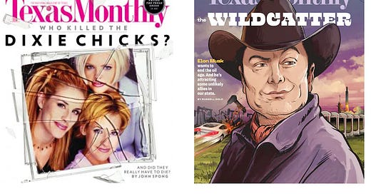
1. For the first time in two years, perennial winner, Vogue was not only tumbled from her top slot, but we don’t see Vogue anywhere in the rankings. Too much time in the checkout lanes scanning the iPhone? This year, the always fresh Texas Monthly takes the top spot with a look into the Dixie Chicks controversy. Great image, great cover lines, and bonus points for working the great songwriter Steve Earle into the skyline.
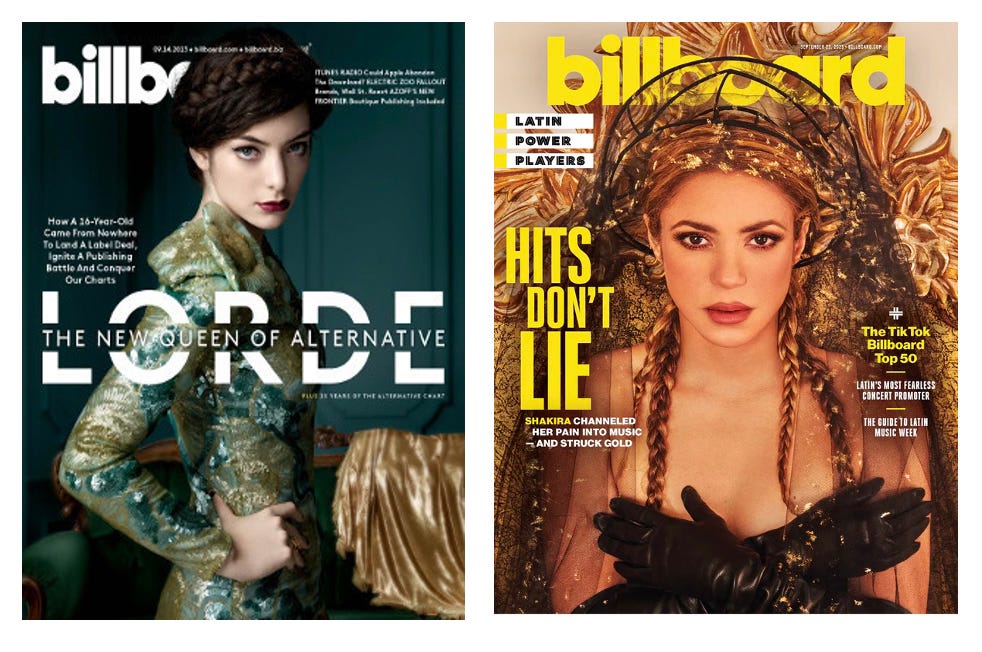
2. Here’s an interesting case of a magazine I didn’t see at retail (See, already broke my own rules). But I did see the image batted all around social media and my first thought upon seeing the cover was “Great image!” And then, Lorde’s new song turned into a earworm that would not go away. So does this Billboard cover set an example of a cover image that lives and promotes beyond retail and print?
3. Cynics think that regional magazines are all about “Top Docs” and “Best Restaurants”. But regional magazines are so much more and the best can go far beyond simple service and feature journalism. The May issue of Boston Magazine expressed everything that needed to be said about the marathon bombing.
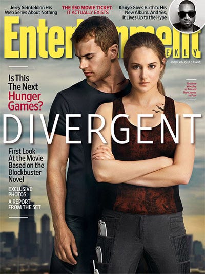
4. I’ve never been a big fan of cover tabs, and pop up images in the corner are even less of a turn on for me. But my favorite magazine, Entertainment Weekly gets a nod this year for their excellent image featuring the upcoming YA adaptation of Divergent.
5. When I browse several nearby Barnes & Noble stores, I always scan the back of the racks where the imports are. I have a huge weakness for UK and Aussie titles. This year Love Magazine celebrated its fifth birthday and featured five unique covers to highlight the event. All of them are great. But this was the first one that jumped out at me and made me pay attention.
6. The kerfluffle about New York Magazine changing its frequency was really much ado about nothing, as far as I was concerned. Magazines change frequency. Business plans adjust to meet new marketplace realities. That’s life. But in the meantime, look and this cover and tell me it doesn’t make you smile! And want to do a selfie on a spacewalk!
7. A few months ago, I was in a local Walgreens when an older gentleman walked up to the counter and asked the cashier if they had TV Guide in stock. “No,” she said, “We don’t have anything like that.” Ouch! Well, in the last reporting cycle, TV Guide had a circulation of over 2 million, over 800K Twitter followers and more than 100K followers on Facebook. Is that has big as they used to be? No. Are they still in business and adjusting to new realities? Yes. This year, they celebrated their 60th anniversary with a selection of really great covers. Here’s the one that took me in at first glance (on display in that Walgreens).
8. The “Person of The Year” is a big deal at Time Magazine and this year not only did they choose well, but they crafted a cover that really captures the image and humanity of the new pope.
9. I’m never sure what to conclude about this statistic. Outside Magazine’s single copy sales are about what they were when I worked at the magazine over twenty years ago. Whatever you conclude, the publication continues to create great covers with bold colors, great images, and clever, but not cute cover lines.

10. Who says newsweeklies can’t catch the imagination and inform the public? Bloomberg Businessweek continued to inspire this year with a series of creative, interesting and occasionally jaw dropping covers. This one really captures not only the content of their feature article, but really makes you laugh out loud. Want to see what the art director, Richard Turley is up to? You can follow him on Twitter @Mr_Turley. (Editor’s Note: Turley is now the EIC of the look book Nuts)
So for a moment, let’s drop the worry over where this ship is going. We pretty much know already. Let’s instead celebrate the great creativity that exists in spades in this industry and the wonderful words and images we try to sell to the public each week.
Now, let’s come back to the present. How’s the year going for you? What covers, new launches, new initiatives grabbed you? Made you excited? Made you want to keep on keeping on in “magazine media?”
This week, in things placed in front of the magazine rack
I hope you enjoyed this newsletter. Please “Like” and subscribe. You’ll get a brand new release in your email in-box every Tuesday (Or sometimes Wednesday if things get a little hectic around here).
Want to find me on the social sites?
My Instagram link is here.
I’m now hanging out at Post.News and you can find me here on this new app.
Want to see me in a suit and tie and with neatly trimmed and combed hair? Here’s my LinkedIn profile where I try to look all professional.
Off you go! Time to empty out the in-box, check your progress on all of your projects, see what’s up on the “Thanksgiving Horror Stories” slack channel…


