Been There, Done That, But You Still Should Read This
I've had a hoot the past few weeks working with two neophyte publishers who are insistent on getting their magazines distributed onto the newsstand this year. No, they're not crazy, they're not planning on going broke. They both strike me as reliably sane, well organized, very intent professionals who are looking to expand the reach of their brand. And they want to do the right thing by their readers and their advertisers. So what they put on their covers is at the top of the list of things we discuss. It's surprising how many publishers don't give much thought to their cover selection process and how important that cover is to newsstand sales. Cover appeal can equal a sale and that equals cash. Even for subscribers, the cover is the first thing they see when they open the mail. How the magazine appears to the subscriber impacts renewals. A renewal equals cash flow. What surprises me even more, is how often publishers don't even ask their newsstand staff (if they have one), or their consultant (who doesn't come cheap), for input on how to select a good cover. I always include a piece in my first informational packet on what can help them select good covers. It includes advice on getting into the groove of putting cover selection higher up the list of priorities. Here are some of my rules of thumb for getting the most out of your single copy covers:
The Logo
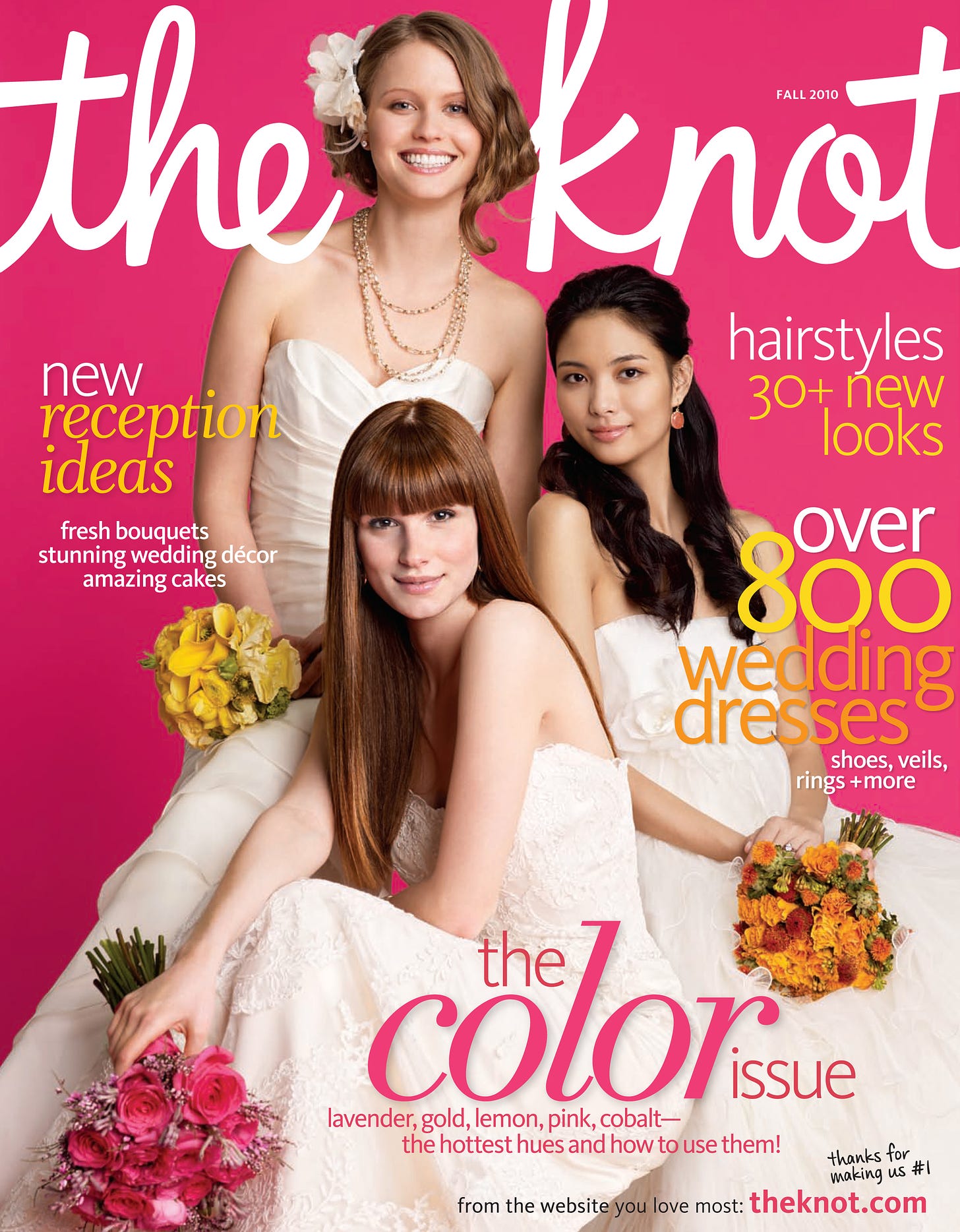
Use words that convey action words. Avoid the passive. Use a logo that is easily recognizable. It should tell your reader exactly who you are and what you are all about. Go with bold colors. I prefer primary colors and neon colors. White and Black are good, but don't blend it in with your cover image. Is your logo clear in both meaning and image? Your reader should know exactly who and what you are as soon as they see the cover. Don't be cute.
Coverlines
Left justified will work better than right or center. It's how most displays work and it is where your reader's eyes will go first. Promote action with action words (See above). Pick up this magazine NOW so you can find out HOW TO in 10 MINUTES and why this is the BEST ever! Avoid using inside baseball lingo. Did you really mean to be so cute? Please don't. Make sure your font is legible. Illegible fonts = 0 sales. Remember action words? Here's more that inspire action on the part of the reader: Free, Bonus, Anniversary, Best of. Use the "Skyline" This is the area above the logo. It's the Best Place to Promote a Lead Story (OK, see how "too cute" that was?).
Cover Image
Is the image clear? If your image is muddy, your newsstand sales will be muddy too. If it's not clear what your image is about, then all the clever cover lines in the world will not help you. Did I say avoid cute? I meant it. Unless your magazine is child centric. Then go be cute all over the place.
Did you use the highest possible dpi? Make sure you do.
The image should be related to the primary coverline.
And Don't Forget
Designing the cover is an integral part of putting the whole magazine together. If the cover is left to the last moment, it will show. Your readers will know that. If you have people on staff who know single copy sales and marketing, show them the cover before you go to press. You don't have to like what they say, you don't even have to agree. But get their perspective and understand that they know how to sell magazines. They are there to help. Really.
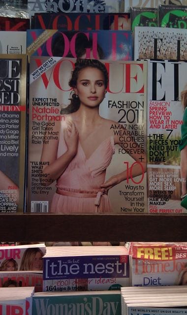
Below are a few covers that I have really grown to love.


