And The Runners Up Are: The Completely Biased, Highly Subjective and Unscientific List of the Top 2012 Magazine Covers
So now we've released the list of the top ten covers, managed the comments, spoken with the people who liked the list, or really hated the list. I spoke with one person who was pretty sure I was crazy. Last year we added a "Runner's Up" list. Not because everyone deserves a participation trophy or because we're all winners. But simply because there were a great number of choices and so many magazines grabbed my attention this year. 1) Bloomburg Business Week - Week of February 8: As Mr. Magazine, Samir Husni pointed out earlier this year, just because Newsweek is gone from the print world, doesn't mean that newsweeklies are dead. Bloomburg Business Week has had so many great covers this year. While newsweeklies don't have the large newsstand presence that they used to, they are still key category leaders in airports and bookstores. This cover resonated strongly and made me laugh out loud when I picked it up earlier this year.

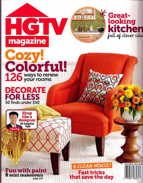
Let's laugh and sell some copies. 2) HGTV Magazine October/November 2012: This magazine completed a successful test last year and was converted into a regular frequency title this year. To say that sales have been great, is an understatement. The colors in this cover as well as the kitchen call out really jumped out and attracted my attention.

A great looking kitchen and a clean house. I'm in! 3) Juxtapoz Magazine January 2012: Honestly, when the January issue of Juxtapoz showed up in the office (Editor's Note: Juxtapoz Magazine is a client.) I was originally not in love. But the longer it sat in my rack, the Audrey Kawaski cover in all of it's simplicity just grew on me. As a rule, stay away from browns in cover images. Here's where you can break that rule. I love it's color palette and simple lines.

4) Texas Monthly March 2012: This award winning Emmis owned title and arbiter of all things Texas dropped this wonderful cover in March. Two great airline covers in 30 days? Why not award them both?

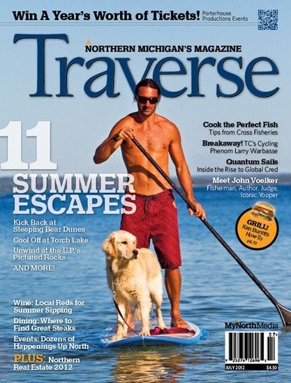
Who needs land sharks when there are sharks in the air? 5) Traverse Magazine July 2012: This small city magazine from Northern Michigan makes it's second appearance in two years. What are one of Michigan's greatest appeals? The lakes. Who loves dogs? Almost everyone. What's one of the newest and most promising technologies for magazines? QR codes. What's on the cover of this magazine? All of the above.

Oh, and I have one more. Let's call this an "Honorable Mention". More than twenty years ago, I spent a year working with the original editor and publishing company of Silent Sports Magazine, a title now published by Journal Communications. Our goal was to expand the the newsstand presence of the magazine and for awhile we were able to do just that. But we couldn't maintain the distribution efficiently and we shut the project down. The design of the title was, at best, early Page Maker and the covers were whatever was available at the last minute. But the editorial was what you want in a magazine. Focused, passionate, dedicated, involved. For many years, the editorial of this title made it one of my favorites and a subscription that was happily renewed (and no one ever offered me a clock, t-shirt or watch).
I don't remember how or why, but I noticed that Silent Sports revamped its look this summer and while it's clear that this is still a small regional title, it's also clear that they put a lot of thought and effort into what they were doing. And it looks like they succeeded. And it looks like I need to get reacquainted with some great editorial.

A big leap forward in design. What covers do you think were overlooked this year?


