A Trip to the Newsstand May Help Your (Cover) Image
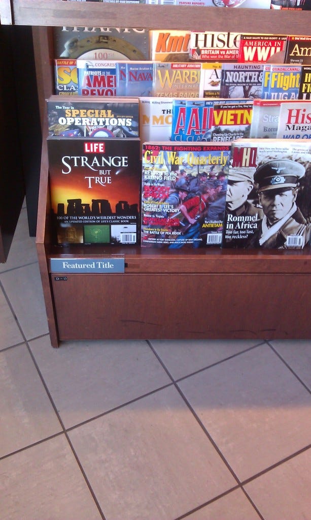
Two of my favorites: Life Specials vs. Civil War Quarterly.

I often wonder why some art and editorial departments seem so reluctant to talk with their circ teams and ask them what they think about cover images and logos before they send the files off to press. In an old blog post I saw awhile back (And I regret not hanging onto the link) the writer proposed that the single copy "experts" he had been researching, on the whole, really didn't know what the heck they were talking about when it came to cover selection and images. It was all a crap shoot, he concluded. Fortunately he didn't imply that we had poor body hygiene or fashion sense.
To a certain extant, that writer had it right. There often is the luck of the draw when it comes to the selection of cover images.
But look at the image above and ask yourself which logo and image stands out, and which does not.
Rocket science? I don't mean to pick on any particular magazine.
For the record, I've often recommended to art and editorial departments that if you don't want to talk to the person you hired to be your single copy sales expert for any reason under the sun. Be it that you just don't like that person, you don't want to be in the same room as them, you're afraid you're going to catch cooties, they're too snarky and sarcastic, you think they're full of prunes, whatever. Do this one thing:
Print out a high resolution scan of the cover. Go to your nearest newsstand, pop the cover onto the stand in a wide variety of positions.
And then honestly ask yourself if it works.
One half hour out of your work day seems like a small sacrifice.
And for the record, most of the single copy "sales experts" I know are really, really nice people. You should get to know yours.


